Shopify Collection Page: Better Experience for a Small Catalog

A small product catalog can make a standard Shopify collection page feel sparse and give shoppers less context around the products.
When IMP Marketing received this brief, we started looking at the Shopify website from a broader perspective: how we could better communicate the spirit of the brand and give shoppers more reasons to buy and trust the brand. Because of the limitations of a small product catalog, this led us to improve several parts of the shopping experience. In this case study, however, we’ll focus specifically on how we redesigned the Shopify collection page.
The Context: What Did the Original Shopify Collection Page Look Like?
The client was a household brand entering the US, who was still building brand awareness. So people landing on the collection page knew nothing about who was behind the products.
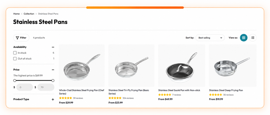
At this stage, the store had around 21 products split across 8 collections. Most collections had only 2-3 products, and some had just 1-2 products. The collection pages used a simple product grid, with each product displayed individually. As a result, some pages had very little content beyond a few product cards.
The Challenge: Why Was a Small Catalog a Challenge for the Shopify Collection Page?
With only a few products in each collection, some collection pages felt sparse and gave shoppers little to explore. At the same time, the brand was still building awareness in the US, which meant shoppers also needed more context to understand and trust the brand.
The challenge was to make the Shopify collection page feel more complete while using the limited space and product range to build brand trust.
The Solution: How Did We Redesign the Shopify Collection Page for a Small Catalog?
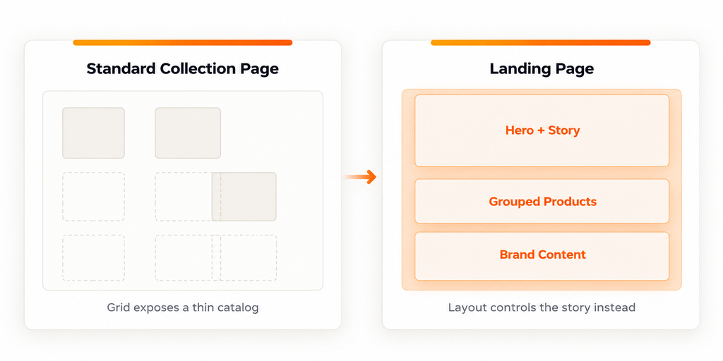
Instead of using a single product grid, we redesigned the Shopify collection page with multiple sections to support different parts of the browsing journey. Each section had a different role: introduce the brand, guide shoppers toward key products, create more ways to buy, and show the products in a more realistic context.
1. Starting With a Hero Banner to Introduce the Brand
The first change was adding a hero banner at the top of the collection page.
The collection page did not have a hero banner, so we added one to introduce the collection and overall spirit before shoppers moved on to the products. This was especially relevant because 67% of shoppers sought information about the brand first (Reeves, 2021). Therefore, the hero banner is a useful place to bring that brand context into the collection page from the start.
We do not suggest that every collection page needs a hero banner. For this case, however, it supported our decision to surface more brand context early rather than letting the product grid speak for the entire brand.

2. Bringing Best Sellers Forward as a Starting Point
After introducing the brand, we wanted shoppers to reach the products quickly. Instead of giving every product the same visual weight, we brought in the brand’s best-selling and most representative SKUs. This gave new shoppers a clearer place to start and allowed us to highlight the products that best showed what made the brand different.
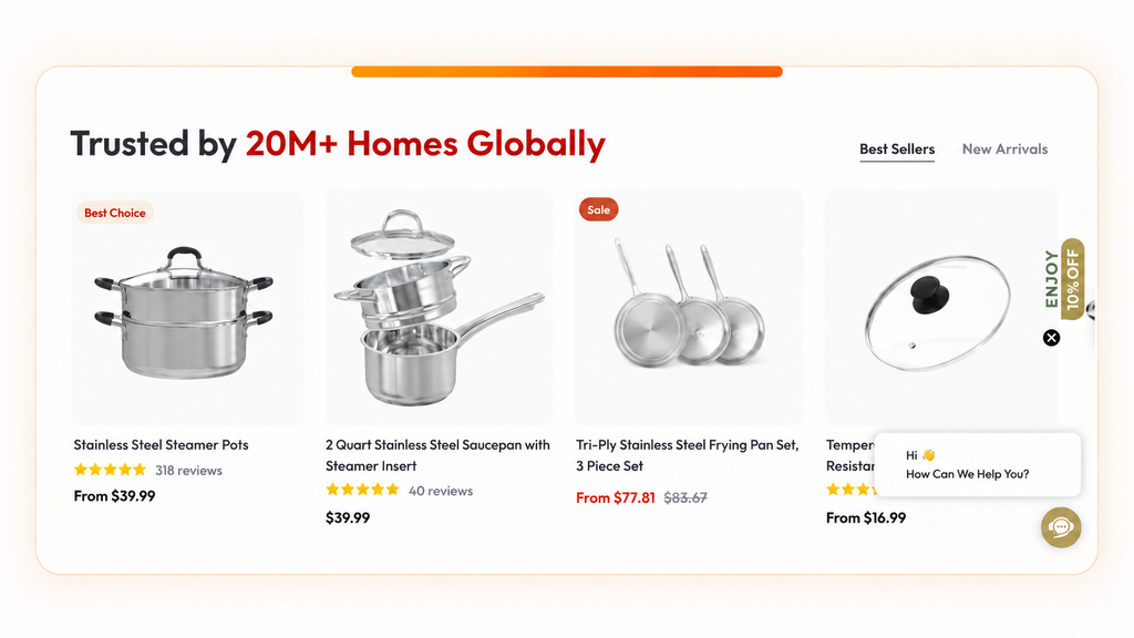
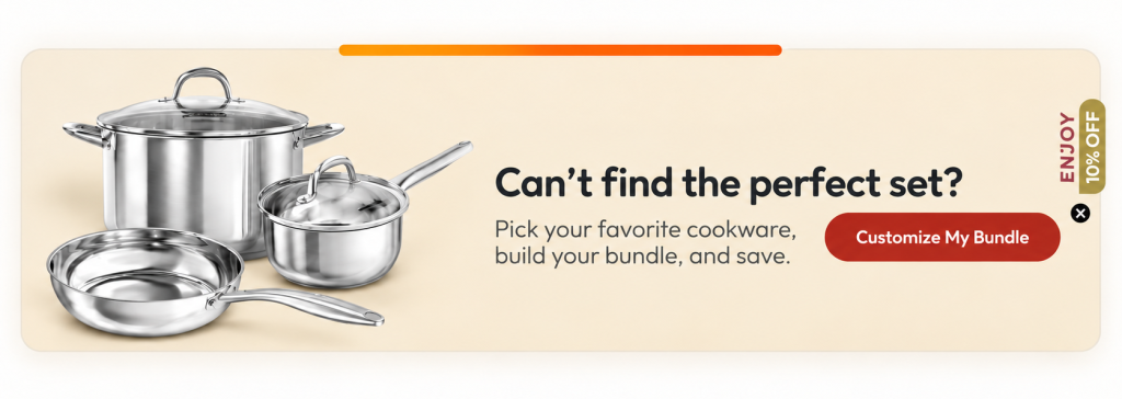
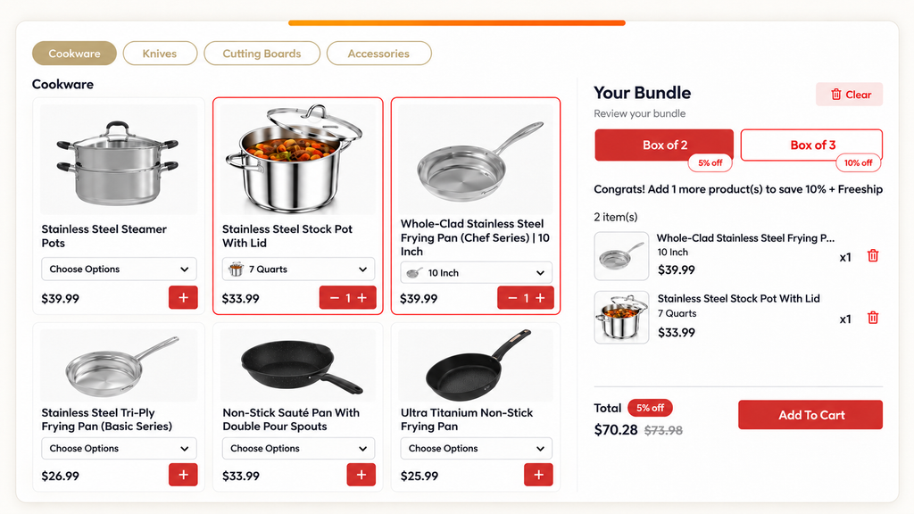
3. Creating “Customize My Bundle” to Give Shoppers More Ways to Buy
When we reviewed the collection, the products were being presented as individual items. Shoppers could see each product clearly, but there was no easy way to combine related products based on a specific need or use case.
Product bundles can encourage shoppers to buy more by making related products feel more complementary and easier to purchase together (Kobuszewski et al., 2024). So we created “Customize My Bundle,” where shoppers could build their own set from selected products.
On the one hand, there was also a business reason behind this decision. Orders under approximately $50 did not generate enough room to cover marketing costs while maintaining a healthy margin. That made increasing AOV an important part of the strategy. Chris Pitocco, writing for Shopify in 2026, explains that product bundling can help increase cart size and AOV, while build-your-own bundles give customers more flexibility to choose the products they actually want.
On the other hand, the bundle did not need to be pre-packed. Since the client was already using Amazon FBA, we could keep the current fulfillment setup. Shoppers could still purchase the products together as a set on Shopify, while Amazon fulfilled the individual items without extra cost.
4. Adding Recipes, Videos, Reviews, and Customer Content
The final part of the page moved beyond showing what the products were and focused more on how they could fit into customers’ lives.
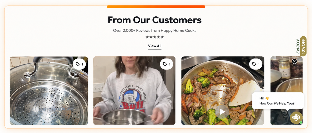
We added recipes to show shoppers how the products could be used in real life. For a household goods brand, this helped connect the products to practical use cases instead of showing them as standalone items.
41% of users in product-page testing watched product videos, and those videos helped shoppers picture how the products could fit into their everyday lives (Jamie Holst, 2019). Based on this, we added videos throughout the page to show the products in use and give shoppers more real-life context beyond product images.
We also added reviews and customer content to show the products in more realistic settings and real customer images that can help shoppers evaluate products more confidently (Cassie Galante, 2024).
Rather than relying on any one of these elements alone, we used them together to add context throughout the collection page.
The Result & Lesson: What Changed After We Redesigned the Shopify Collection Page?
The hero section now tells shoppers who the brand is before they start scrolling. Best Sellers puts the top products up front and makes it clear how they differ from each other. “Customize My Bundle” gives people another way to buy and a natural reason to add more to the cart. Recipes, videos, reviews, and customer content show how the products actually get used day to day.
With the product range still the same, the collection pages now give shoppers more to explore while also giving the brand more space to build trust.
The takeaway: a small catalog doesn’t automatically mean you need more SKUs. What is missing is clear presentation, smart bundles, and enough context for shoppers to see the value and range the brand already has.
Quick Case Study FAQ
1. Can brands make a Shopify collection page feel more complete with a small product catalog?
If those products are already part of the brand’s real roadmap. We also asked whether additional products were already on the roadmap. If so, selected upcoming products could be introduced as “Coming Soon” to add more depth to the collection, show shoppers how the catalog is developing, and create anticipation around future launches.
2. What should you check before rebuilding your Shopify collection page this way?
Before you add more content to a collection page, check whether the catalog size actually calls for it. Extra sections help when a standard grid would look thin. They shouldn't be the default for every store.
Think ahead about what happens when more SKUs come in. A layout built for a small catalog can feel cluttered once the assortment grows, so keep the structure flexible enough to go back to a simple product grid when that happens.
Whatever you add, shoppers still need to scan the products quickly. Recipes, UGC, and reviews earn their spot when they help someone decide what to buy. If they're only there to fill space, cut them.
And don't treat the page as finished. When inventory changes, revisit the layout and make sure it still fits the catalog you actually have.
3. Should every product in a small catalog receive the same amount of attention?
Not necessarily. When there are fewer products, brands have more room to merchandise them differently based on their role in the assortment. Some may be strong entry products for first-time shoppers, while others may make more sense as complementary purchases, premium options, or products suited to a specific use case. Thinking about these roles can help determine which products deserve more visibility, which should be grouped together, and where additional explanation may be useful instead of treating every SKU as an identical product card.